Is there really any debate about how complex mathematics can be? Especially when it comes to graph-related topics? All sorts of random lines drawn—x, y, z; and if you try to translate that into Bengali, it gets even more confusing. Latitude, longitude, segments, complex parts… so many things! Why make learning so difficult?

Dear reader, I agree with you. There’s no need to make studying harder than it is; but graphs are still important. (“Oh no!”—did you just say that?) Don’t worry; there’s nothing to fear. Read on with courage and you’ll see—graphs can actually be quite fun!
It’s much easier if we ask straightforward questions, just like children or scientists do, and then try to find the answers.
The first question is: why do we need graphs? Take a look at the list below.
| Year | Height |
| 2001 | 158 cm |
| 2002 | 159 cm |
| 2003 | 160 cm |
| 2004 | 162 cm |
| 2005 | 163 cm |
| Year | Height |
| 2001 | 160 cm |
| 2002 | 160 cm |
| 2003 | 160 cm |
| 2004 | 163 cm |
| 2005 | 165 cm |
| Year | Height |
| 2001 | 163 cm |
| 2002 | 165 cm |
| 2003 | 167 cm |
| 2004 | 169 cm |
| 2005 | 170 cm |
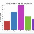
So, what do you understand? Surely you got something from this, but it’s not very clear. The information feels scattered. That’s because the data didn’t create a picture in your mind as a whole. You could have easily done this with the help of a graph. Take a look at the images (graphs?) below:

Here, the purple column shows my friend’s height, the maroon column shows my height, and the yellow column shows my rival’s height. From this chart, we can easily draw a few conclusions:
- From the beginning, I was shorter than both my rival and my female friend.
- My height gradually increased, but my female friend’s height did not grow much at first. For example, until 2003 her height stayed the same. But afterwards, suddenly she started growing much faster than me.
- My rival was already tall (no need to be upset!) and continued to grow at a steady rate.
- At the start of 2005, my friend might have left me behind (would you have guessed that without using a graph?)!!
So, this is more or less the necessity of graphs. And through this method—by simply looking at a picture—we can make many important decisions. But first, we need to develop the ability to interpret such pictures. Very often, for the sake of visual presentation, data is shown using ‘line graphs’. The previous illustration can be called a column graph, because we presented our data with columns. Now, if we present this very data using lines, the picture would look like this:

Here too, you can easily see that my rival’s line is much higher than mine. Moreover, on average, my friend’s line is also above mine.
The sad truth is, in real life we encounter much more complicated graphs. And we have to make decisions based on them. If we just learn which types of graphs represent which types of information, it will be much easier for us to make decisions. Gradually, we’ll look at different kinds of graphs and try to understand what they tell us.
Suppose Microsoft decided to conduct research on Bill Gates’ entire business career and all the wealth he’s acquired over the years. Through this research, we’d be able to learn how much Bill Gates’ fortunes increased each year. Imagine the research team presented their findings in a line graph. The graph might look something like this:


সুন্দর উদ্যোগ। বাংলায় এ ধরনের পড়াশোনা বিষয়ক (বিশেষ করে বিজ্ঞান বিষয়ক) প্রবন্ধ প্রকাশের প্রচেষ্টা অত্যন্ত প্রশংসনীয়। চালিয়ে যান।
nice,
Fun,Bollywood,mp3,Gallery,Tamil,Natok,Download,Movie,Free Software,Tutorials,Screensavers,Wallpapers,
Computer Bazar Update,market,Latest Bollywood News, Star Interviews, Bollywood Chat, Hindi Songs, Movies
Reviews and Previews, Bollywood Gossip, Shop Online, Free E-mail, Chat with Bollywood stars,
Download hindi songs in Real Audio and mp3 format and much much more..
Visit http://www.moonbd.com
Thanks for sharing.